
The Real Truth About Canva and ChatGPT-Generated Logos
Posted by AC Daywitt on Jul 30th 2026
Why Almost Anyone Can Design a Logo Today... But Very Few Create a Great Brand.
If you're starting a business today, you've never had more options for creating a logo.
Open Canva.
Ask ChatGPT for ideas.
Use an AI logo generator.
In just a few minutes, you can have dozens of logos that look polished and professional.
I think that's amazing.
These tools have helped thousands of small businesses create logos and marketing materials without spending hundreds—or even thousands—of dollars on a designer.
But they've also created a new problem.
Today, almost anyone can create a logo.
Very few people know how to tell if it's actually a good logo.
After more than twenty years in the promotional products industry, I've watched thousands of logos make the journey from a computer screen to coffee mugs, embroidered shirts, business cards, vehicle graphics, signs, lip balm labels, and countless other products.
I've learned something that surprises a lot of people.
The logos that look the best on a computer screen aren't always the ones that perform the best in the real world.
Why Everyone Is a Designer Now
Not that long ago, creating a logo usually meant hiring a graphic designer, waiting through revisions, and paying a significant amount of money.
Today, things are completely different.
You can ask ChatGPT to brainstorm ideas.
You can build graphics in Canva.
You can use AI to generate dozens of logo concepts in less than a minute.
That's incredible.
It gives entrepreneurs and small businesses opportunities they simply didn't have before.
But here's what many people don't realize.
Creating a logo has become easy.
Creating a logo that works everywhere is still hard.
Most people decide if a logo is good by asking one question.
"Does it look cool?"
After working with logos for more than twenty years, I've learned there's a much better question.
"Will this logo still look great everywhere my business uses it?"
That's the question that separates a nice-looking logo from a truly great one.
Looks Great... Until You Print It
One of the biggest mistakes I see is assuming that if a logo looks great on a computer screen, it's ready for the real world.
Unfortunately, that's not always true.
AI is incredibly good at making logos look impressive.
Add some gold.
A shiny chrome effect.
A dramatic background.
A little lighting.
Maybe a reflection.
Suddenly it looks expensive.
But those effects aren't the logo.
They're just decoration.
Think about a truck commercial.
The truck is driving through the mountains.
The sun is setting.
The music is perfect.
Everything looks amazing.
But nobody buys the truck because of the commercial.
They buy it because it can do the job.
A logo works the same way.
The fancy image is just the presentation.
The real test comes later.
Can it be embroidered on a polo shirt?
Can it be laser engraved onto a stainless steel tumbler?
Can it be printed on the side of a promotional pen?
Can it be cut from vinyl for a vehicle graphic?
Can it be screen printed on a T-shirt?
When all of the special effects disappear, you're left with only the design itself.
That's when you find out whether you have a great logo...
Or just a great-looking picture of one.
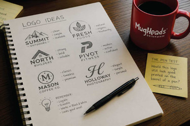
The Pen Test
Over the years, I've come up with one simple way to judge almost any logo.
I call it The Pen Test.
Ask yourself one question.
Would this logo still look good printed in one color on the barrel of a promotional pen?
If the answer is yes...
You're probably looking at a strong logo.
If the answer is no...
It's probably too complicated.
Why a pen?
Because there aren't many places harder to print a logo.
The print area is tiny.
There's usually only one ink color.
There are no gradients.
No shadows.
No metallic effects.
Very little room for tiny details.
If your logo passes The Pen Test, chances are it'll also work beautifully on:
- Coffee mugs
- Water bottles
- Lip balm tubes
- Embroidered apparel
- Business cards
- Signs
- Vehicle graphics
- Trade show displays
- Laser engraving
- Packaging
The pen forces you to focus on what really matters.
A simple, memorable design.
The One-Color Rule
Many years ago, someone in this industry gave me a piece of advice I've never forgotten.
Start with black.
Before you worry about colors...
Before you add gold...
Before you add shadows...
Before you add textures...
Before you add fancy effects...
Make sure your logo looks great as solid black artwork on a white background.
If it does...
You've built a strong foundation.
If it only becomes interesting after adding special effects...
Then the effects are doing the work.
Not the logo.
Think about some of the world's most recognizable brands.
You'd recognize them instantly in solid black.
That's because great logos are built on strong shapes—not special effects.
ChatGPT Can Actually Help You Create Better Logos
This might surprise you.
I don't think ChatGPT is the problem.
I don't think Canva is the problem.
In fact, I use AI myself.
The problem is that most people ask it the wrong question.
Instead of asking for:
"Create a shiny gold luxury logo with chrome effects."
Try asking for this instead:
"Create a simple one-color black logo that is easy to recognize, easy to read, and works for embroidery, laser engraving, signs, business cards, promotional products, and the barrel of a promotional pen."
That's a much better challenge.
Now AI has to solve the real design problem instead of simply decorating the answer.
Once you've created a logo that looks great in one color...
Then go have fun.
Create the gold version.
The chrome version.
The watercolor version.
The wood version.
The neon version.
Those are fantastic marketing graphics.
They're just not the logo.
A PNG Isn't a Brand
One of the most common emails I receive starts like this:
"Here's our logo."
The attachment is often:
- A screenshot
- A Facebook profile picture
- A low-resolution image
- A Canva download
- A PNG file
Those files are perfectly fine for sharing online.
But they're usually not enough for running a business.
A professional logo package should include:
- A vector file that can be resized without losing quality
- A full-color version
- A black version
- A white version
- A one-color version
- Horizontal and stacked layouts
- Brand colors
- Font information
Without those files, you'll eventually run into problems when it's time to embroider shirts, print promotional products, wrap a vehicle, create signs, or produce anything with your logo on it.
Final Thoughts
Canva is an incredible tool.
ChatGPT is an incredible tool.
AI is changing the way businesses create marketing materials, and I think that's exciting.
But no tool can replace good design.
After spending more than twenty years helping businesses put their logos on everything from coffee mugs and lip balm tubes to embroidered jackets and laser-engraved drinkware, I've learned one simple lesson.
A great logo doesn't just look good on a screen.
It works everywhere.
So before you call your logo finished, remember two simple ideas.
The One-Color Rule
If your logo doesn't look great as solid black artwork on a white background...
Keep refining it.
The Pen Test
If it wouldn't look good printed in one color on the barrel of a promotional pen...
Simplify it until it does.
Because the best logos aren't remembered because they have the fanciest effects.
They're remembered because they're simple.
They're remembered because they're recognizable.
And they're remembered because they work everywhere.
Color should make a great logo even better...
It should never be used to hide a weak one.